Contrary to popular belief, fixing e-health for seniors isn’t about just making buttons bigger; it’s about fundamentally rethinking the design philosophy from being feature-centric to confidence-centric.
- Most platforms fail by creating high cognitive friction and ignoring the deep-seated digital trust deficit among older users.
- Effective design simplifies processes to a few clicks, provides clear human context for data security, and chooses technology that reduces user burden.
Recommendation: Shift focus from adding features to meticulously removing every point of uncertainty, ensuring each interaction builds the user’s sense of safety and competence.
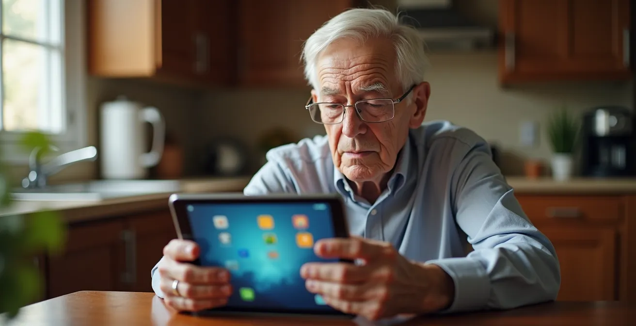
The healthcare industry is pouring billions into e-health, yet a critical demographic remains largely excluded: seniors. For healthcare administrators and app developers, the metrics are often baffling. Why, despite feature-rich platforms, is uptake among older adults so dismally low? The common answers—use larger fonts, simplify menus—are dangerously superficial. They treat the symptoms of a much deeper disease in user experience design.
The problem is not a checklist of UI tweaks. It’s a fundamental misunderstanding of the senior user’s reality. These users often grapple with a trifecta of challenges: declining sensory and motor skills, a different model of what “intuitive” means, and a profound, rational skepticism about digital privacy. An app that is perfectly logical to a 30-year-old developer can feel like a high-stakes, confusing labyrinth to a 75-year-old patient. This creates immense cognitive friction and anxiety, leading to rapid abandonment.
If the true goal is adoption and improved health outcomes, we must move beyond cosmetic fixes. The key is a philosophical shift toward what can be called “confidence-centric design.” This approach prioritizes the user’s feeling of safety, control, and competence above all else. It’s not about what the app *can do*, but about how it makes the user *feel* while doing it.
This article dissects the critical failures of e-health UX for seniors. We will move from the obvious visual flaws to the deeper strategic mistakes in process design, interaction models, data security, and even architectural choices. The goal is to provide a clear, critical framework for building digital health tools that seniors don’t just tolerate, but willingly embrace.
To navigate this critical analysis, the following summary outlines the key areas where current e-health design is failing its senior users and how a new approach can bridge this gap.
Summary: Why E-Health Platforms Fail Seniors With Poor UX Design?
- Why Small Fonts and Low Contrast Make Apps Unusable After 70?
- How to Design a Appointment Booking Flow in 3 Clicks or Less?
- Voice Commands or Touchscreens: Which Is More Intuitive for Arthritis?
- The “Digital Divide” Oversight That Leaves Rural Seniors Without Care
- How to Use Design Elements to Make Seniors Feel Safe Sharing Data?
- Why a Doctor Can’t Accurately Diagnose Abdominal Pain Over Zoom?
- WebRTC or Native Apps: Which Architecture Is More Secure for Patients?
- How Smart City Furniture Improves Urban Safety by 30%?
Why Small Fonts and Low Contrast Make Apps Unusable After 70?
The most cited failure in senior-focused design is visual accessibility, and for good reason. It’s not a minor inconvenience; it’s a hard barrier that renders an application completely useless for a significant portion of the target audience. As people age, physiological changes like presbyopia, cataracts, and reduced sensitivity in the retina make reading small text on low-contrast backgrounds physically taxing or impossible. In fact, Nielsen Norman Group research reveals that over 60% of Americans aged 65+ have difficulty with close vision. When an app uses 12px grey text on a white background, it’s not a stylistic choice; it’s an act of exclusion.
The problem goes beyond simple legibility. For a senior user, struggling to read instructions or labels creates immediate cognitive friction. It erodes confidence and introduces a feeling of incompetence before they’ve even completed a single task. This initial frustration is often enough to cause them to abandon the app entirely. They won’t blame the font size; they’ll conclude, “this technology is not for me.” This is a critical failure that no advanced feature can overcome.
Design teams must treat accessibility standards not as optional guidelines but as a foundational requirement. This means adhering to established benchmarks like the Web Content Accessibility Guidelines (WCAG). For senior users, this involves a specific set of non-negotiable practices:
- Implement a minimum 16px font size for body text and at least 24px for critical action buttons.
- Ensure a contrast ratio of at least 7:1 for normal text and 4.5:1 for large text to guarantee readability.
- Add text labels to all icons. Relying on iconography alone assumes a shared digital vocabulary that many seniors do not possess. A floppy disk icon means “save” to a millennial, but it’s just a confusing square to many others.
- Use high color contrast, avoiding combinations that can “vibrate” or are difficult for color-blind users to distinguish.
- Provide simple, easily discoverable controls within the app to allow users to adjust the font size themselves, putting them in control of their own experience.
How to Design an Appointment Booking Flow in 3 Clicks or Less?
Once a user can see the interface, the next major hurdle is navigating it. For seniors, a complex, multi-step process like booking an appointment can be a significant source of anxiety and confusion. Many e-health platforms, in an attempt to capture all possible data upfront, create booking flows with excessive fields, optional settings, and branching paths. This approach creates a high cognitive load, forcing the user to make numerous decisions and increasing the likelihood of errors or abandonment. The goal should be the opposite: radical simplification.
An ideal booking flow for a senior user should be achievable in three clicks or taps, maximum. This isn’t a gimmick; it’s a design constraint that forces developers to prioritize what is truly essential. Each screen should present only one clear action. For example: Step 1: “Choose a Doctor.” Step 2: “Select a Date & Time.” Step 3: “Confirm Appointment.” All non-essential information, like filling out detailed medical history forms, should be deferred to a later stage, perhaps as a pre-visit task sent via email or handled at the clinic.

This philosophy of one action per screen minimizes confusion and builds momentum. The user feels a sense of progress and accomplishment with each tap, reinforcing their confidence. The interface should also provide clear, persistent feedback, such as “Step 2 of 3,” so the user always knows where they are in the process and how much is left. This predictability is a powerful tool for reducing anxiety.
Case Study: Jane App’s 3-Click Booking Success
Jane App has been widely praised in the healthcare industry for its simplified booking flow. By focusing on a one-action-per-screen model, the system allows patients, including a large base of elderly users, to book appointments in just a few clicks. The platform automatically saves progress at each step, so an accidental exit doesn’t force the user to start over. This intuitive design, which prioritizes simplicity over feature density, has been shown to significantly reduce booking abandonment rates and improve patient satisfaction among older adults.
Voice Commands or Touchscreens: Which Is More Intuitive for Arthritis?
For seniors with motor impairments like arthritis, Parkinson’s, or hand tremors, the physical act of interacting with a device can be a significant barrier. A standard touchscreen interface that relies on precise tapping, swiping, or pinching gestures can be frustrating and even painful. This is where designers must critically evaluate the interaction model itself. The debate often centers on touchscreens versus voice commands, but the answer isn’t a simple “one is better.” Each has distinct advantages and challenges for this user group.
Touchscreens, when designed correctly, offer the benefit of discoverability. Options are visible on the screen, and the user can see what they need to do. However, the physical interaction must be forgiving. This means designing large tap targets (at least 44×44 pixels) and avoiding reliance on complex gestures. As a leading medical journal points out, the interaction must be straightforward.
Favor control tapping over gesture interactions. Gestures require advanced motor skills that may be difficult for older users.
– JMIR mHealth Research Team, Design Guidelines of Mobile Apps for Older Adults
Voice commands, on the other hand, eliminate the need for physical interaction entirely, which is a huge benefit for those with severe dexterity issues. However, they introduce a new kind of cognitive load: memory. The user has to know or learn the specific commands to operate the app. This can be challenging, especially for users with mild cognitive impairment. Furthermore, voice recognition systems can struggle with different accents, speech impediments, or quiet speakers, leading to frustrating errors. The best approach often depends on the specific task, as a comparative analysis shows.
| Interface Type | Advantages for Arthritis | Challenges | Recommended Use |
|---|---|---|---|
| Touch with Large Targets | Visual feedback, discoverable options | Requires fine motor control | Navigation and selection |
| Voice Commands | No physical interaction needed | Memory load for commands, accent issues | Data entry and dictation |
| Hybrid Approach | Leverages strengths of both | Higher complexity | Optimal for seniors |
Ultimately, a hybrid approach is often the most effective. Allow users to navigate menus and make selections with large, easy-to-tap buttons, but offer voice commands as an alternative for tasks that require extensive typing, like filling out a form or describing symptoms. Giving users the choice empowers them to use the method that is most comfortable and effective for them on any given day.
The “Digital Divide” Oversight That Leaves Rural Seniors Without Care
A perfectly designed app is still useless if the target user cannot access it. The “digital divide” is a well-known concept, but in the context of senior e-health, it’s often tragically oversimplified. It’s not just about owning a smartphone or having an internet connection. For many seniors, especially those in rural or low-income areas, the divide is a complex web of interconnected barriers that developers and healthcare administrators frequently overlook.
The first barrier is reliable, high-speed internet. Telehealth video calls require significant bandwidth that is often unavailable or unaffordable in rural communities. An app that works flawlessly on a developer’s fiber-optic connection may be a stuttering, unusable mess for a senior on a slow DSL line. The second barrier is the cost and maintenance of the device itself. A high-end smartphone is a significant expense, and managing software updates, security patches, and app installations can be a daunting technical challenge for someone with low digital literacy.
Finally, there’s the physical barrier of access and support. A recent NHATS study shows that 32.3% of Medicare beneficiaries report vision impairment affecting their use of digital devices, a problem compounded when there is no family member or local tech support to help them set up and learn new tools. This isolation is a critical part of the digital divide that remote software development teams often fail to see. Expecting a senior in a rural area to independently download, configure, and learn a complex medical app is often an unrealistic and failed strategy.

Bridging this divide requires thinking beyond the app. Solutions could involve partnerships with local libraries or senior community centers to provide free Wi-Fi and on-site support. Another powerful approach is the creation of dedicated health kiosks in these public spaces. These kiosks can run a simplified, locked-down version of the e-health platform on a large, accessible touchscreen, providing a controlled and supportive environment for seniors to access digital care without needing their own device or internet connection.
How to Use Design Elements to Make Seniors Feel Safe Sharing Data?
For many seniors, the biggest barrier to using e-health platforms is not usability but a profound lack of trust. They have been conditioned by years of news stories about scams, data breaches, and identity theft to be deeply skeptical of sharing personal information online. This “digital trust deficit” is a rational and powerful emotion that most app designs fail to address. A generic privacy policy link and a small padlock icon are utterly insufficient to build the kind of confidence required for a user to share their most sensitive health data.
Building trust requires a shift from technical reassurances to human ones. The design must actively work to make the user feel that their data is being handled by responsible people, not an anonymous, faceless corporation. This means replacing technical jargon with plain-language explanations and humanizing the interface at every security touchpoint. Instead of a sterile “Your data is protected by TLS 1.3 encryption,” a more effective message might be, “Your information will be sent securely and confidentially to Dr. Evans’ office.”
This human-centric approach to security can be remarkably effective. It reframes the interaction from a transaction with a machine to a conversation with a trusted healthcare provider.
Case Study: Building Trust Through Humanized Security Interfaces
A redesigned pharmacy app, detailed by the team at the mobile development firm Orangesoft, provides a powerful example. The developers replaced standard technical security messages with photos of the actual pharmacists and simple, direct explanations. For instance, after a user uploads a prescription, the screen shows a message like, “Your pharmacist, Sarah, will now review this.” This small change led to a 40% increase in trust metrics and higher completion rates, as senior users felt far more comfortable sharing their health information with a person rather than an algorithm.
To systematically build this trust, development teams should conduct a thorough audit of their security and privacy interfaces, focusing on empathy and clarity. The goal is to transform every security checkpoint from a barrier into a moment of reassurance.
Action Plan: Auditing Your App for Senior Trust
- Identify Touchpoints: List every screen where the app requests personal data, asks for permissions, or mentions security (e.g., login, profile setup, file upload).
- Translate Jargon to Clarity: For each touchpoint, replace technical terms (“encryption,” “protocols”) and generic icons (padlocks) with plain-language explanations of who will see the data and why it’s safe.
- Humanize the Interface: Inventory where you can replace a system message with a human face. Could a confirmation screen show a photo of the nurse or doctor who will review the information?
- Audit Permission Timing: Review every permission request. Is it asked for “just-in-time” (e.g., microphone access when starting a video call) or all at once on startup, which can trigger suspicion?
- Provide Confirmation & Control: Ensure every sensitive action gives the user clear, unambiguous visual feedback that it was successful, along with an easy-to-find way to review or manage their shared data.
Why a Doctor Can’t Accurately Diagnose Abdominal Pain Over Zoom?
While improving UX is critical, developers and administrators must also confront a hard truth: technology has clinical limitations. The push for “telehealth-first” models often ignores the essential role of physical examination in diagnostics. A video call simply cannot replicate a doctor’s ability to palpate an abdomen, listen to a patient’s breathing with a stethoscope, or perform other hands-on assessments. For vague but potentially serious symptoms like abdominal pain, dizziness, or shortness of breath, a remote diagnosis is not just suboptimal; it can be dangerously inaccurate.
This creates a significant UX problem rooted in a clinical reality. When a senior user turns to a telehealth app for a serious concern and is met with an inconclusive consultation or is immediately told to go to an emergency room anyway, their trust in the platform is shattered. They feel the service has failed them in their moment of need. This experience reinforces the belief that the technology is a “gimmick” and not a substitute for “real” medicine. The result? They are less likely to use the platform in the future, even for issues that telehealth *is* well-suited for, like prescription refills or follow-up conversations.
This is a major driver of platform abandonment. While specific data on seniors is emerging, broader healthcare UX research indicates that up to 30% of patients abandon telehealth platforms due to poor usability and perceived ineffectiveness. To mitigate this, e-health platforms must be brutally honest about their limitations. The user interface should actively manage patient expectations from the very beginning.
Instead of presenting telehealth as a panacea for all medical issues, the app should guide users to the appropriate level of care. A smart triage system could ask a few initial questions. For a simple rash, it might direct the user to a video call. For a report of chest pain or severe abdominal pain, it should immediately and clearly direct the user to seek emergency in-person care, explaining *why* a physical exam is necessary. This honesty doesn’t devalue the platform; it builds trust by demonstrating that the patient’s well-being is the top priority, not keeping them within the app’s ecosystem at all costs.
WebRTC or Native Apps: Which Architecture Is More Secure for Patients?
The choice of underlying technology, often invisible to the end-user, has profound implications for a senior’s experience, particularly regarding security and accessibility. The two dominant architectures for delivering real-time communication are browser-based WebRTC and installable native applications. For developers and administrators, the decision is often based on development cost or feature sets, but for a senior user, the choice can be the difference between adoption and frustration.
Native apps offer deep integration with the operating system’s accessibility features, which can be a significant advantage. However, they come with a heavy burden for the user. A senior must first navigate an app store, successfully download and install the application, and then manage a series of permission requests that can seem invasive and suspicious. This initial friction is a major drop-off point. Furthermore, as one expert analysis notes, the maintenance falls squarely on the user’s shoulders.
Native apps put the burden of updates, permissions, and OS compatibility on the senior, a significant point of friction.
– Digital Health Architecture Review, Mobile Apps for Older Adults Design Guidelines
WebRTC, on the other hand, runs directly in a web browser. This means there is zero installation required. The user simply clicks a link sent via email or text message, and the video consultation opens in a familiar environment. All updates are handled on the server side by the provider, completely removing that burden from the user. From a security perspective, it operates within the browser’s “sandbox,” limiting its ability to access the user’s device and often feeling less intrusive than a native app demanding broad permissions.
While native apps can offer a more polished experience and deeper hardware integration, the sheer simplicity and lower friction of WebRTC often make it a superior choice for the senior population. The trade-offs are clear when laid out side-by-side.
| Architecture | Senior User Experience | Security Model | Accessibility Features |
|---|---|---|---|
| WebRTC (Browser) | Zero installation required | Browser sandbox, implicitly trusted | Limited to browser capabilities |
| Native App | Installation barrier, update burden | Broad permissions may trigger suspicion | Better integration with OS accessibility |
Choosing an architecture is a strategic decision that directly impacts user trust and accessibility. For a demographic that values simplicity and is wary of complex technical processes, the path of least resistance is often the most effective.
Key Takeaways
- Visual accessibility (large fonts, high contrast) is a non-negotiable baseline, not a feature.
- Confidence-centric design prioritizes the user’s feeling of safety and control over feature density.
- The best interface is often a hybrid, leveraging the strengths of touch for navigation and voice for data entry.
How Smart City Furniture Improves Urban Safety by 30%?
The future of senior e-health extends beyond personal devices and into the very fabric of our communities. Integrating health technology into public infrastructure—so-called “smart city furniture”—represents a paradigm shift from reactive to proactive care. While goals like a 30% improvement in urban safety are ambitious targets for municipal projects, the underlying technology demonstrates a clear path toward making cities safer and healthier for aging populations by creating an ambient, automated safety net.
Imagine public benches, bus shelters, or park tables equipped with passive health monitoring sensors. These systems could, for example, detect if a person has been sitting motionless for an unusually long time or if a sudden impact consistent with a fall has occurred. Instead of requiring the senior to actively use an app or press a button—which may be impossible during a medical crisis—the furniture itself could trigger an alert. This alert could go to a family member, a community health worker, or directly to an emergency telehealth service, instantly opening a line of communication.
This concept of ambient, zero-input health monitoring is already being proven in more controlled environments, providing a blueprint for wider urban implementation.
Case Study: Smart Furniture for Emergency Telehealth Response
Research into smart home technology highlights the potential of sensor-equipped furniture. Smart beds and chairs with integrated health monitors can detect critical events like falls or potential cardiac irregularities. In pilot programs, these systems have demonstrated success by automatically alerting caregivers or connecting to emergency telehealth services, opening a voice channel for immediate assessment. This requires zero input from the user during the crisis, drastically reducing emergency response times and providing a crucial link to care when it’s needed most.
Expanding this model into the urban environment requires a coordinated effort. It’s not just about the technology but about creating an ecosystem of care. To be effective, smart city health initiatives should include a range of integrated features:
- Weatherproof tablets in bus shelters for easy appointment booking or accessing health information.
- Fall detection sensors integrated into public seating areas in parks and transit hubs.
- Free, reliable WiFi and charging ports at all major transit stops to bridge the digital divide.
- Emergency response buttons on lampposts and benches that provide a direct audio/video link to a telehealth operator.
Ultimately, the failure of e-health platforms for seniors is a failure of empathy. To succeed, developers and healthcare leaders must move past the surface-level fixes and adopt a confidence-centric design philosophy. To put these principles into practice, the next logical step is to conduct a thorough audit of your current digital tools from the perspective of a 75-year-old user, focusing relentlessly on removing friction and building trust at every single click.